Friday, December 31, 2010

Drawing from Line to Life by Mike Sibley

This is THE Drawing Bible. There is not any other book available that covers drawing as completely as Mike's book. It reads like a novel, as each chapter builds upon the next, but it also is a great reference tool. AND it is a piece of artwork itself - beautifully illustrated. Mike is not only a talented artist but an excellent writer. He writes as though he is personally talking to you. I guarantee you will be inspired and captivated after the first chapter. (yes, it's that good...)


For a limited time, Mike is offering free shipping!! Don't miss out on this incredible offer and order your copy today: http://www.sibleyfineart.com/pencil-drawing-book.htm.   Are you sure one copy is enough? I just bought a second copy today so I can share one with my drawing classes while preserving my original copy.


Sunday, December 26, 2010

Drawing Techniques - Workshop

Drawing Techniques Workshop
with Diane Wright

Professional artist and author of "Drawing Made Easy: Beautiful Landscapes", Diane Wright is now offering a local drawing workshop.

Diane covers drawing basics not taught in general drawing classes. She will share her techniques and in-depth information to get you on your way to making successful and realistic landscapes.

 
  • Day 1 We'll introduce ourselves and discover your goals for drawing. We will take an in-depth look at drawing pencils, paper and tools. There's more to graphite drawing than just a wooden pencil and paper. Lots of examples to be shown and explored.

  • Day 2 Through exercises we will explore techniques from pencil strokes to application of line and tone. Blending, layering and creative erasing will be covered as well as an introduction to Negative Drawing.

  •  Day 3 Using these techniques we will apply what we've learned to drawing textures. Wood, rocks, leaves, etc. Understanding what to look for and how light interacts with surfaces will also be discussed.

 
During all these sessions, she will work with you personally to assist and demonstrate these techniques. No matter what your present ability, you will leave with new-found knowledge of how to draw and use textures to benefit your work. You'll discover that Drawing is Fun!

Where: Kreativ ent
306 1st Ave W
Newton, IA 50208

When: 9:00 - 11:00 am Saturdays, January 29, February 5 & 12 (6 hours total)

Cost: $50.00 Class size is limited to 6-8 for personalized attention!

Price includes minimum supplies of: sheets of paper as required, Staedtler pencils 4H, 2B, Staedtler kneadable eraser and chamois.

Please bring your own drawing board and other drawing tools you use.
- - - - - - - - - - - - - - - - - - - - - - - - - - - - - - - - - - - - - - - - - - - - - - - - - - - - - - - - - - - - - - -
Drawing Techniques Workshop with Diane Wright
January 29, February 5 & 12

Name:___________________________________________________________

 
Address: ______________________________ City: ______________________

Phone: __________________________ Cell Phone: ______________________


Email: __________________________________________________________


Tuesday, December 21, 2010

Happy Holidays!

...and a Merry Christmas to you all!


Les and I spent an afternoon exploring the renovated Union Station in Kansas City. It is the second busiest freight railroad center in America. It has a rich and diverse history dating back to 1914. The architecture of this building is incredible and the ceiling is breathtaking.

I sincerely thank everyone who has followed my postings this year and wish the best of the Holiday Season to you all!

Diane

Sunday, November 21, 2010

Artist Reception

Artist Reception
for Diane Wright
December 9th - 5-7pm

Kreativ ent.
306 1st Ave W
Newton, IA 50208

You are invited to attend an artist reception for Diane Wright. 
Visit with the artist, share some wine/cheese,
and see her artwork on display.
(artwork and signd books will be available for purchase.)

Saturday, November 20, 2010

Fading Light


Fading Light

This is an attempt at creating a "moody landscape", working with light and dark composition to create a mood. The viewer is slowly led into the dark veil of the woods with just hints of the trees deep in the shadows.

Here is a detail of the water. There is a tendency to leave the water in light values. But to create both transparency and depth, the water streaming over the rocks must be darkened. I used 2H and H chisel point leads to create the smooth flowing water. The turbulence and splashes use negative drawing...working in the shadows and base of the waves.


Tuesday, October 26, 2010

New Tutorial: How to Draw Grass & Weeds

New Tutorial: How to draw Grass and Weeds


I am pleased announce that my newest tutorial is now available on my website - "How to Draw Grass and Weeds". For your convenience, a downloadable .pdf is available at the bottom of the page.

A Blackwing Monday

The Blackwing Pencil is starting to make it's name amongst the graphite artists. Here is another fun story!

************
A Blackwing Monday
Woke up yesterday-very early which always makes me grumpy. There was messy white stuff - SNOW- on the lawn. Certainly not a mood enhancer! BUT things improved , the mail came early for a change bringing with it only 1 bill & (drumroll please!) my package of Palamino Blackwings. Oh, the joy, oh the anticipation, oh the sleek black box ! I sharpened just one. By the way the Palomino Long Point Pencil sharpener is great.

I'm not on the marketing committee for the company, I've just been strangely influenced by the rest of you- scary, but it is Halloween week.
So far, I've just gone back over some old sketches with the Blackwings. One insipid tree really came alive. I may even have the courage to post it when I get my new printer-scanner set up. My old one went to electronic heaven last week.

Do you understand why the simplicity of a 'pencil' brings such joy? Aren't we blessed by our craft? Treat yourselves- these pencils are worth it.

Linda Fode
graphite artist

*************
I think Linda has it right.  There is something special about the simplicity of a pencil and to a graphite artist, it's pure joy!

Thursday, October 14, 2010

First Impressions - Palomino Blackwing

It's good to know I'm not the only pencil fanatic!

Here are two wonderful first impressions of the new Palomino Blackwing pencils by two great artist friends.  Be careful graphite artists....the Blackwings are addictive. 

*************************************************************************************
Stranded at home while my car is in the shop this morning, I opened the package that came in yesterday. I saved it for this morning, knowing that I'd be cranky.

My roommate was unsympathetic. She knows I went to Goodwill yesterday to find a raincoat and paid $10 for it. So she pokes at me for spending twice that on a dozen Palomino Blackwing pencils.

"It's a pencil." she says, after I let her pick one up.

Granted, she hasn't finished her coffee yet. And she was waiting with irritation for her laptop to come up so she could read the news. But she accused me of 'fondling' my new pencils and said it was 'disturbing'.

I poked at the pencil, discovered that the eraser can be removed. Sharpened it. And picked up a rough sketch of a fallen sycamore on the lake shore that I had started a few days ago. I filled in an area blocked off in the shape of a pine tree, using my new pencil. It took me about 2 minutes to achieve a lovely, dark pseudo-realism.

I held it up and she blinked. "Wow. Cool. It builds up shadows fast, doesn't it?" She said. Sipping her hot coffee with a slurp. Then she turned to her e-news. "But it's still just a pencil."

Sigh.

Planning to go to DC this afternoon, if my car gets done, and I'm taking pad and Palominos with me.

Here's my opinion after a weekend of experiments: As dark as Ebony drawing pencils, but with thinner and dryer lead. Sketches lightly, with good control and produces dark lines quickly and easily with less shine than 4-5B lead. Not as covering as higher 8-9B leads, but much nicer for sketching.

Karen J. Newhouse
CapallGlas Studio
http://www.capallglas.com/

*************************************************************************************
Karen - LOL! That's a cute write up of the pencils.

I got mine as well. They are not just a pencil. No, no no...They are magical pencils, that take you to places that only your imagination can conjure up. They are special pencils.

I quickly got the box open, grabbed a pencil & sharpened the wood off.  I just couldn't make myself to cut the lead yet. I went to work & just wrote with it. Wonderful, exquisite, smooth, dark.

Toby Levin
moleskin sketching artist
*************************************************************************************
Toby - I think you might have said it all when you called the Blackwing a magical pencil. On different paper surfaces, it becomes a whole different experience!

Karen is such a creative writer as well as an excellent artist.  I can't wait to see what she creates using the Blackwings on gesso panels! 
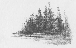
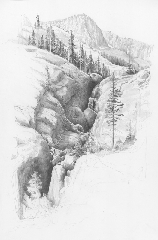
Here are a couple of sketches using the Blackwing on Bristol Board Vellum. The Vellum has a rougher texture and the graphite slides on creating a beautiful texture and with a few layers, a rich black. I'm loving this pencil more and more....

Thursday, October 07, 2010

The Palomino Blackwing

I received my box of Palomino Blackwings in mail today.  That was quick delivery and wow...what a nice packaging!

I would love to hear from all my graphite artist friends who have purchased the Palomino Blackwing pencils.  I'd like to know what you think of them....both the good and the bad.

Be sure to give it a good work out!  If you remember reading my assessment of the  pencil, I initially did not give it very high marks.  But since then, I've given it a full workout on a couple of drawings, and it has proven to be an excellent tool for building beautiful mid-value graphite tones.

In the drawing "Agnew Meadows", I used the Blackwing in the darker trees in the foreground.  By applying initial graphite layers by the Blackwing and then applying 2B over this, I created a beautiful rich dark tone.  In the past, I frequently would end up with an uneven tone with spots of the "dreaded" graphite shine.  But the Blackwing seems to have a nice matte finish providing a wonderful base.

As with any technique, your approach, type of paper or unique style may provide different results.  I'd love to hear what you think of these unique pencils!!

Diane

Wednesday, September 08, 2010

Agnew Meadows

This has been a whole new approach to drawing...working in the darker tones and leading the viewer through the scene by the lighting.  Let me know what you think of this composition and style.


Tuesday, September 07, 2010

The Palomino Blackwing Pencil

A new pencil with a completely different feel

I was selected to test out the new Palomino Blackwing pencil. The original Blackwing 602 was discontinued by Faber Castel and is now being re-introduced by the Palomino producer's Cedar Co of California

Part of the test was to compare it to the original Blackwing as well as the Palomino HB pencil.  Since I never even heard of the Blackwing pencil until a month ago, I felt it important for me to find the real thing.  I coughed up the $$ and purchased one from ebay.  It is a pre-1958 vintage Ebarhard Faber Blackwing 602. 

Now on to the comparison of the new Palomino Blackwing to the vintage model as well as to the Palomino HB .

I think the hype regarding the vintage as being the best pencil ever made, is just that...hype.  The wood in the vintage pencil was difficult to sharpen, leaving a rough texture and reminds me of why I have never cared for using wooden pencils.  The new Palomino Blackwing matches the other Palomino's top quality wood and sharpens clean with no splintering.  The new Palomino Blackwing slick design and white eraser is also much improved over the vintage model.

The new Palomino Blackwing is an unusual pencil in that it doesn't feel like graphite.  It has a carbon or clay feel to it and it doesn't leave a super shiney layer. It also compares more closely to a 2B than an HB grade in both softness and tone value.  The CEO of Cedar Co., Charles Berolzheimer, says I'm the first to make this comment. He thinks it could be that since I use a wide variety of graphite leads, I am probably very sensitive to the grades. He may very well be right on this as I use a variety of grades from 4H to 6B.

During my testing and comparison, I didn't care for the new Blackwing.  I have to be honest  and say that I did not give it a good rating when I reported back to Charles.

But I couldn't stop at just a few pencil strokes.  The real test is to see how it lends itself to drawing.

I am pleasantly surprised that the new Palomino Blackwing's "non-graphite" characteristics can create rich black tones that are incredible.  But I will let the drawing speak for the pencil....

Here is my current work in progress using the new Palomino Blackwing for the canopy of dark trees, a 2B .5mm mechanical pencil for the grass, and a 4H chisel point clutch pencil for the background trees (using the Blackwing to layer the darker areas on top of the 4H).  The darks lay down quickly and evenly and create a rich "black". 

My final report to Charles?  This pencil is DEFINTELY a keeper and I am looking forward to pushing my landscapes to a whole new level of rich darks.  Thank you Charles!!

Saturday, August 21, 2010

Silver Reflections

As with any new tool, you need to explore just what you can do with it  and new pencils are no different.  So I pushed from the lightest to darkest using only two of the grades, 2B and 2H, of the Palomino Pencils.  The sky is done using a light layer of 2B chamoised smooth, with subtle changes to reflect the clouds hovering on top of the mountain peak.  The distant mountain texture is taking advantage of the 2B graphite grain on the paper  (300 Series Strathmore Bristol Board smooth).  The 2B is continued to be used to create the mid and foreground trees.

The water is created using the 2H.  The harder lead lends itself well to create the glass smooth stillness of the lake.  Using horizontal strokes, the gentle and subtle reflections are drawn in. 

Silver Reflections 
4-1/2 x 7- 3/4

This is from a reference photo taken by my nephew, Kyle Clark, during a recent mountain bike trip to Mt. Shasta in California.

Saturday, August 14, 2010

Palomino Pencils

Joey Centanni of Pencils.com requested that I try out some of their premier Palomino pencils. I kind of chuckled because if there is one thing I don't use is wooden pencils. But since they are featuring my artwork on their website, I thought the least I could do is to see if I liked their product.

I am pleasantly surprised and very impressed by the wonderful graphite quality of these pencils! They are encased in high quality cedar wood and the graphite is as smooth as silk.  The lead grades range from 2H, H, HB, B and 2B.  But don't let that fool you!  The 2H is comparable to an HB and the 2B is more like a 4B without the graininess!!

I'm an avid mechanical pencil user so I didn't think it was possible, but the Palomino just might make a convert out of me!  Here is my first drawing using these pencils.....but I guarantee it won't be my last.

Gentle Cascades

Saturday, July 17, 2010

Mike Sibley Workshops

I've been working this morning on the underside of the tree and grass using techniques that I learned during Mike Sibley's drawing workshop in Indiana.

It's been almost a year since the workshop and the improvement on my artwork has been incredible. And the revelations of "ah-ha"! are still happening!

To attend one of Mike's drawing workshops is an opportunity that any graphite artist should not miss. It doesn't matter what your subject matter preference is or your drawing style (from realism, sketches or abstract) the concepts and techniques Mike demonstrates can be applied to. Spending three days with one-to-one attention with a master is an experience that I will never forget.

Mike is coming back to the United States in September to conduct 4 more workshops! Visit his website http://www.sibleyfineart.com/ for workshop locations and information.

Here's the section of my current drawing. I've been pushing the branches on the underside of the tree back into the shadows. Using negative drawing techniques, I'm able to create the blackest areas between the leaves, allowing them to subtly appear deep in the shadows.


Friday, July 02, 2010

Barn...continued

Here's the next installment.....


The barn is slowly taking shape....working on balancing the foreground tree with the barn. The barn is tucked in between the trees.

Sunday, June 27, 2010

Misty Morning over Shaver Lake


Here's a quick rendering from a photo taken by my friend Peggy Allsman. Her son spent a scout weekend at Shaver Lake in California. It's a small drawing just 4x8"

Saturday, June 26, 2010

Wisconsin Barn

It's been almost a year since my last barn drawing, so I'd say it's about time for a scene closer to home. Just on the east side of the Mississippi, Wisconsin landscape displays beauty at every turn. This barn is tucked between trees with a vista that spreads out behind.


After playing with a number of different composition possibilities, I've got decided to get started and see where the pencil leads me. Here are the steps I've done so far. The size of the drawing is 10x18 on Mellotex paper stock. It's a relatively new paper for me and is ultra smooth.


The sky is created through a series of cross-hatching and chamoised smooth. I started with a F .5mm mechanical pencil and cross-hatched 3 layers of light, smooth pencil strokes. Then using a chamois to smooth the layer out. 3 layers of 2B cross-hatching, chamoised smooth with a final 2 layers of 2H cross-hatch applied with a light chamois blending to finish a smooth silver-toned sky. I have lightly blu-tacked the clouds. These will be developed as the rest of the drawing develops.


The trees behind the barn are starting to be formed. I start at the tips of the trees and work my way to the dense centers. I keep the leaves loose and open at the tips, allowing much of the sky to peak through. The open areas are as important as the leaf bundle placements. This gives way to the character of the tree. A 4B chisel point clutch pencil allows me to 'paint' the layers of leaves into the trees.


Saturday, May 22, 2010

Shadow Lake Outlet

With some assistance from a wonderful artist friend, Vince Whitehead, I tweaked a couple of areas and really brought depth to the drawing. Added darker trees to the lake edge and added some highlights to the water, and lightened the mountain as it touches the sky. Vince is a talented pen & ink artist, http://www.rural-route-one.com/, and we share a common interest in rural landscapes.


Strong pencil strokes and and negative drawing carries this drawing to completion. Keeping the entire composition loose with minimum detail helps to emphasize movement and energy.


This is another from the Yosemite series. I started this drawing a bit differently than usual as I wanted to block in the foreground rock bluff on the left. (Since I'm a lefty, I typically start in the background and work my way right to left).

I then roughly sketched in the trees behind the rocks. These will get much darker as I work my way through the scene. I'm not getting too detailed as this is more an exploration of composition of light and shadows..... but then isn't that true for any drawing?

Whenever you are using reference photos, try various crops. The brush in the foreground is too dominant. By just cropping a bit of the right and bottom off, the central focus of the scene pops out.


Saturday, March 27, 2010

Shadow Creek Falls


I have enjoyed working on this beautiful landscape. While there is probably a lot I could still work on, I think I'm going to call it done. Leaving portions of it unfinished leaves the eye content to stay in the center of the gorge...as it should be.

Enjoy

Diane

Friday, March 26, 2010

Shadow Creek Falls - WIP4 & 5


Wip 4: Here is a small update. I am slowly working

my way down the cliff. The tree on the right will eventually blend into the cliff behind and won't be as prominent.


Wip 5 : I'm bouncing a bit between the lower left area and the area around the tree on the right. These two sections will need to balance each other in both detail and darks. I'm also starting to tone down some of the highlights on the rocks. The whites need to be retained for just the brightest highlights.


Sunday, March 21, 2010

Shadow Creek Falls

Shadow Creek Falls is nestled in the southern portion of Yosemite and is part of the Ansel Adams Wilderness Trail. This continues a series of drawings from my son's hiking trip to Yosemite last fall.

Part of the challenge to working with an impressive vista is to decide what to include and exclude. I am posting the reference photo to show you just how complex of a scene this is. Matt does an excellent job taking reference photos. He takes full scene shots as well as zoomed-in areas. He has a great sense of balance and composition that makes his photos a pleasure to work with.

My goal is to minimize the complexity and to emphasize the inter-play between the shadows, the tension of the boulders lodged between the crevices and the water finding it's way under, over and round the rocks.

The first step is to crop the image eliminate much of the 'extras' in the scene. Just this small change makes quite a difference.


Wip 1:

I have started with the distant background of the the mountain range. Snow is still visible on these glaciers in September. The tree line diminishes as it reaches to the top of the range.

Drawing Specs:
Paper: Fabriano Watercolor Hot press
Size: 11x17
Pencils used in the background: 2H flat chisel point clutch pencil and F .5 mm mechanical pencil for the trees.


Wip 2 - This scene has a number of background drops or layers. The mountain range creates two layers, one overlapping the other. Then another group of rocks fall between the range and another grove of trees. These have more form and definition to them but mostly drawn using negative drawing. This means drawing the dark space between the trees instead of drawing the actual trees. Once the tree shape is formed, detail is lightly drawn in to give the tree texture. Pencils used at this juncture are: 2B and F .5 mm mechanical pencils.


Wip 3: The Fabriano paper offers the ability to build up many layers of graphite. Starting with 4H - 2H flat chisel point clutch pencils allows large 'blocks' of shading to be done. Then alternating B and 2B creates subtle darkening. The darkest areas demand a strong application of 2B.

This is just over 1/2 of the image as the falls will continue to emerge down on the paper. I believe the image will remain unresolved on the edges, so the focus of the eye will remain on the falls itself.

Shadow Creek Falls - Sketch

This is a prelimary sketch of a drawing that I am currently working on. I wanted to explore the shadows and the shapes of the rocks/boulders as they envelope around the water falls.


Sunday, February 28, 2010

Lake Ediza

My son will be keeping me busy with all the beautiful scenes from California. Over Labor Day weekend he went hiking in Yosemite. As they entered an opening in the trail, this is the view they were welcomed with. This is part of the glacial area. Snow is in the mountain all year round. They just reached Lake Ediza as the sun was setting.

Sunday, February 07, 2010

Human Portraiture

There is a small group of artists who belong to a yahoo group called "Drawing Line to Life". We started the group to study Mike Sibley's book of the same title. I am the moderator and over the last few months have started to review Mike's book again. We have reached Chapter 8 where Mike demonstrates drawing his granddaughter Charlotte. We have decided to expand the topic to encompass human portraiture.


This is such a big topic that we have decided to it break down into smaller segments. As we finish up on our first topic, eyes, I thought it might be beneficial to layout the schedule for the next few weeks. I would like to welcome anyone interested in exploring the topic of drawing human portraiture to join us in our discussions, step-by-steps and sharing of our progress.

  • Feb 1-13 Eyes
  • Feb 14-27 Nose
  • Feb 28 - Mar 13 Mouth
  • Mar 14-27 Ears
  • Mar 28 - Apr 10 Hair
  • Apr 11-24 Head
  • Apr 25 - May 8 Hands
  • May 9-22 Clothed Figure Drawing
I am the first to admit that I am not a portrait artist, but I am using this opportunity to stretch my skills and I hope you all join me in this journey into human portraits. After we have exhausted this segment on portraiture, we will resume our study of Mike's book with Chapter 9.


I would like to invite you to join us.......


http://groups.yahoo.com/group/DrawingLinetoLife/

Diane

Sunday, January 31, 2010

Editor's Choice

I am so excited! I made Editor's Choice on Mike Sibley's Starving Artist site. It has been 5 years since I've had this honor. It is a hall of fame that I feel very priviledged to be a part of.

I have had a gallery on Starving Artist for 5 years. It's a great site for exposure, as Mike gets well over 10,000 hits per month. Walter Foster and Quarto publishing both "discovered" me from his site and it is an excellent match with my own website.

I can't thank Mike enough for all his support and encouragement over the years. He's been the greatest influence on my development as an artist as well as my success. Thank you Mike.

www.starving-artists.net


Thursday, January 07, 2010

Commissioned Artwork of Small Proportions

I recently completed a commission for a client of small proportions. He requested three landscape drawings 3"x 3" square in size. He plans to matt them together. Here is what I created for him.